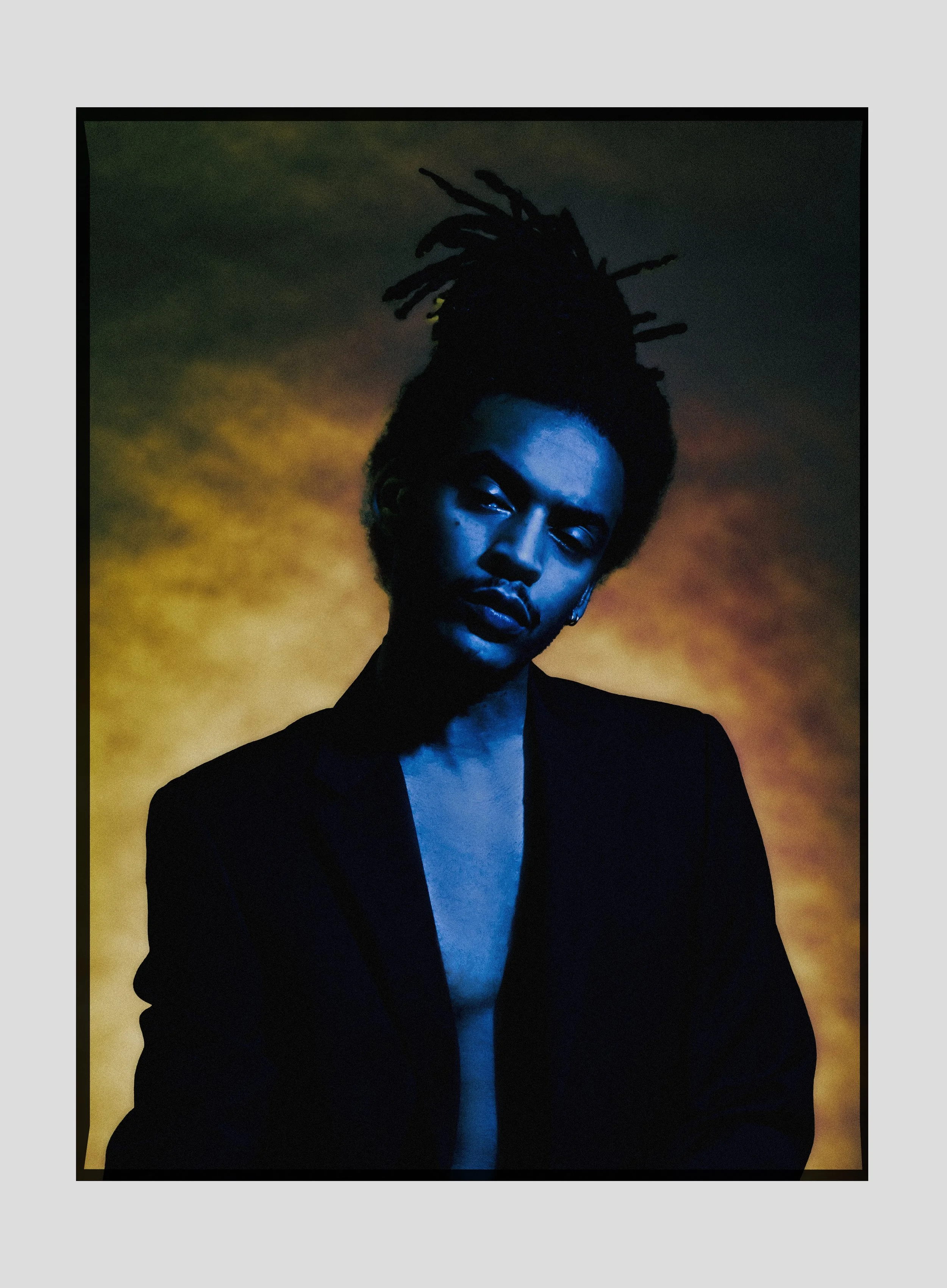
With the creation of Combustion I played on the nature of fire. Its gradient moving smoothly from blue to yellow. The same applies for the heat transfer. The flame gets its blue color due to the part of the flame closest to the bottom burning less carbon than the tip. The blue part is also the hottest burning at 3596º F. My goal from there was to characterize this motion through portraiture. To capture the anticipatory feeling of a lighter flick or the low hum or blue flames hugging a log. Strong but reserved.
To pull forward this vision of fire embodied, I pulled visual reference from Renaissance paintings. Artists like Caravaggio’s generous use of Chiaroscuro lighting I thought added the right amount of drama to the scene. In most Renaissance scenes the subjects are lit with a warm or neutral lighting source creating natural orange and yellow tones on the skin. With Combustion, I thought it’d be interesting to flip this method, adding cold skin with a blue thats luminance has depth, but provides enough visual excitement to match a warmer hue.
With this work I asked questions like: How can two tones embody the same amount of visual excitement even though they are not in the same hue? How can orange be blue and vice versa? What expression would the beginning of a flame make? Combustion is a study – my attempt to visually anthropomorphize one of our most basic elements.
Photography: Canaan Mattson
Model: Colin “Morph” Edwards

